Featured Blog | This community-written post highlights the best of what the game industry has to offer. Read more like it on the Game Developer Blogs or learn how to Submit Your Own Blog Post
Reworking War Robots' prize system with style and user-friendliness
We completely overhaul the event rewards system for the better – here’s how.
July 8, 2024
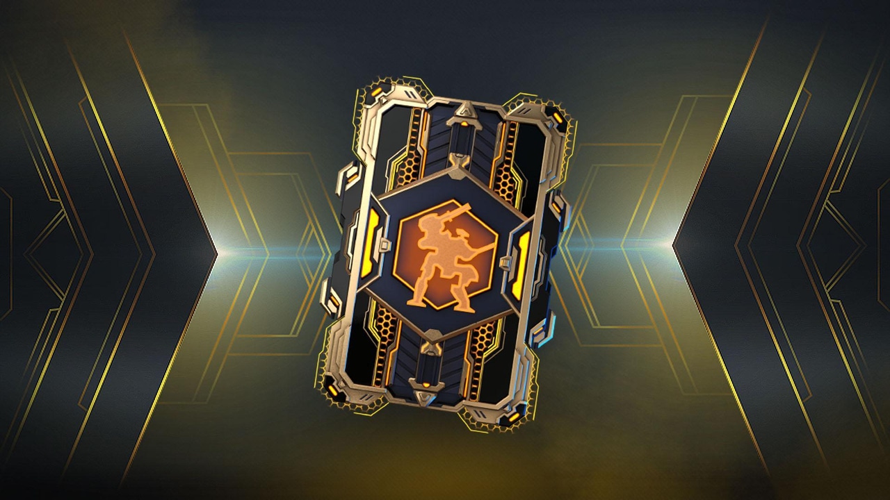
Implementing a new game feature starts with planning; this is true whether it’s adding a layer of content, revising core mechanics, reworking the interface, or making quality-of-life changes. Any successful planning begins with clear goals. And our goal was ambitious: completely overhauling the event prize system in War Robots.
Hello! I'm Nikolay Berezkin, Senior Game Designer at War Robots, and I'm joined by Anton Trofimov, Lead 2D Artist at Pixonic (MY.GAMES). Today, we're excited to share with you the story of how Data Pads, our new content system in War Robots, came to be.
Why revamp the prize system?
Data Pads were born out of a desire to revolutionize our outdated event prize system, which had remained largely unchanged for years. We wanted to transform the way players experience event prizes, making it more visually appealing and user-friendly.
Further, we wanted to expand the range of offers during events so that every player could receive something valuable and reduce production costs and the frequency of visual updates.
It was also important for us to introduce a narrative element to the prize-receiving process, hinting at why a small "container" could hold massive robots and spaceships. This was no easy feat, given the game's 10-year history and the numerous legacy systems in place.
A change of appearance
The first step of our overhaul was ditching the outdated visuals for something modern, universal, and easy to read. The form factor decision was a no-brainer: the name "Data Pads" itself suggested a card-like design – a futuristic storage medium, like a tablet from the future.
Initially, we envisioned each Data Pad displaying a 3D picture or render of the main prize. However, we considered this idea again and ultimately opted to abandon renders due to their high development costs and limited benefits. Despite this change, players can still easily identify which Data Pads contain the most valuable and desirable rewards, thanks to our clever design concept and engaging visual effects when opening the pads. Each data pad has two types of color differentiation: a silver or golden border indicating the quality of the data pad, and the color of the data pad itself – blue, purple, or red – which corresponds to the content of the prize pack.
One of our other key objectives was to break free from the cycle of updating visuals for every event. We wanted players to become familiar with the consistent Data Pad design and eliminate any confusion with other elements. To achieve this, we introduced "card backs", which are event-specific updates that add a fresh touch to the Data Pads without altering their core design.
The first event to feature Data Pads was themed around Beast Knights. As a fitting touch, we chose animal crests as card backs: a wolf, lion, and bear. By examining the Data Pads, players could infer, based on their crests, the rewards they might expect from both the regular and premium (gold) versions.
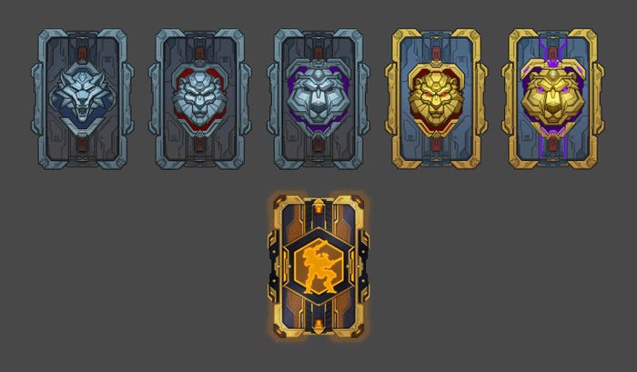
Examples of ordinary Data Pads and golden Data Pads. The latter aren’t available for direct purchase and can only be obtained through in-game activities, like leaderboard competitions
Streamlining how users open the Data Pad
Our next mini-task was to facilitate seamless collaboration between departments in order to develop a new feature for opening Data Pads. This was a rare opportunity for us to work on a large feature that heavily relies on visual elements. However, the game's age presented certain constraints on client development and art, which we had to carefully consider.
To overcome these hurdles, we had to revamp the entire prize-opening workflow. We broke down the feature into several key stages: event HUD, cinematic, prize reveal, and returning to the HUD. Each stage required the expertise of different specialists. Meanwhile, the producer and game designer oversaw the overall vision of the feature, ensuring that the entire team was aligned throughout the development process.
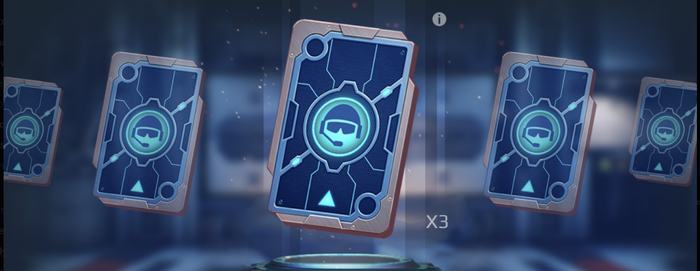
We started with a small UI prototype that simulated navigating the main screens. At the same time, we started working on a cinematic – a short video that would play in the game engine when a Data Pad is opened.
At this stage, we needed to clarify a couple of crucial aspects. We had a rough idea about the appearance of the Data Pads, but how would we present them to the player? During one meeting, an idea cropped up: "Let's have it fall from the sky, with a teleport beam and FX, then boom, the player gets a reward!" And the final version as implemented isn't far from this concept. We knew the feature needed a build-up to the prize, filling the player with anticipation.
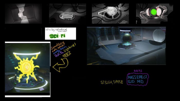
A lot of time was spent brainstorming how the player would receive the reward, where it would appear, and how it would materialize. After numerous experiments, the "heavenly wham" concept evolved into a camera flying through a corridor into a room, where the reward would suddenly appear in a flash of light.
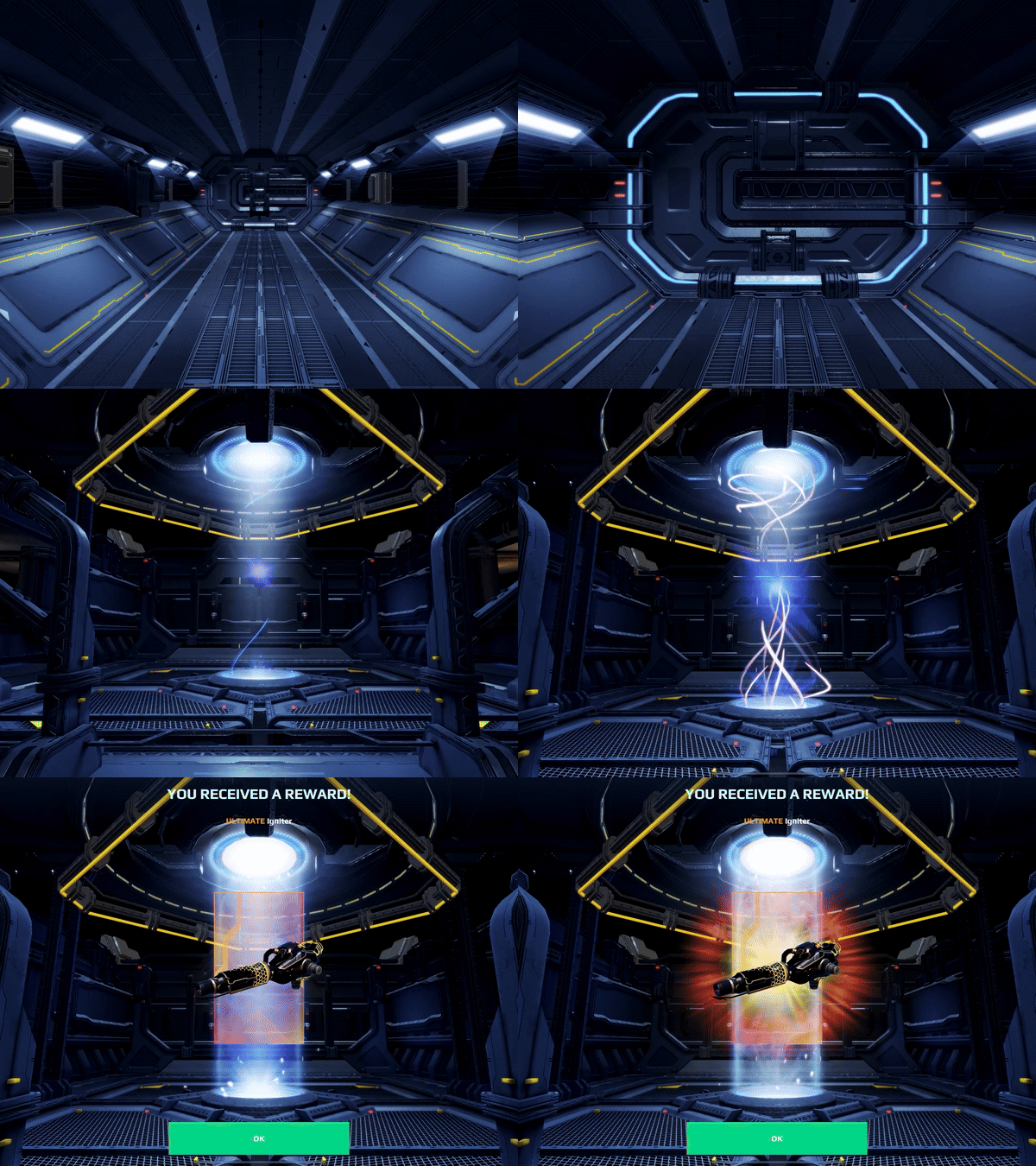
The second crucial question: what exactly is a Data Pad? These are carriers of information, but in the game, it can actually contain a massive robot and a gun. We were concerned about the realism of this device and how to avoid violating the game's logical world. To address this, we came up with a new concept: Data Pads contain encrypted information, like coordinates pointing to the location of prizes won by the player, including in-game currencies, robots, and other content.
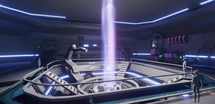
The player-commander uses a decoder key located on their ship to crack the code, and the coordinates are instantly displayed on their screen. This idea became the foundation for our development.
To showcase the connection between the Data Pad card and the prize, we introduced the spotlight pedestal concept. The Data Pad is first revealed and "decrypted" on the pedestal, and then, at the end of the cinematic, the prize itself materializes on a similar pedestal.
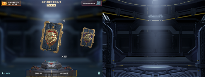
In the final version, this pedestal concept doesn't always shine through as clearly as we'd have liked; the pedestal's visibility varies across different screens, and we didn't want to increase the card's height, fearing it would disrupt the composition. At present, we're exploring ways to fine-tune the design to make it even more stunning.
A UI overhaul
We also focused on making sure the player has a clear understanding of the prizes they can expect. Previously, the loot box displayed a dull, outdated list of prizes – this is a far cry from user-friendliness. Functionally, it was a lengthy carousel with cards, where players had to scroll through to see possible rewards, with prizes seemingly placed haphazardly.
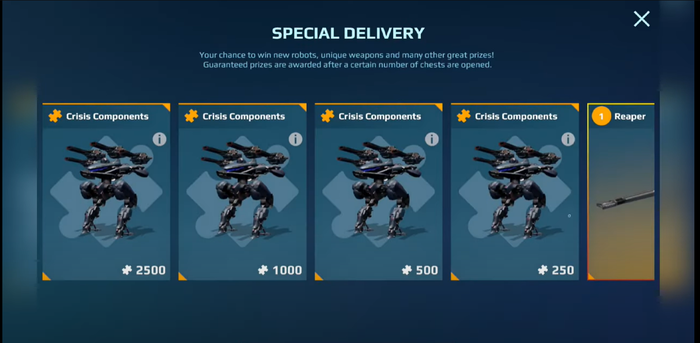
Now, we've updated the UI and breathed new life into it – players can better see the value of the prizes, can categorize them more easily and choose something of interest to them.
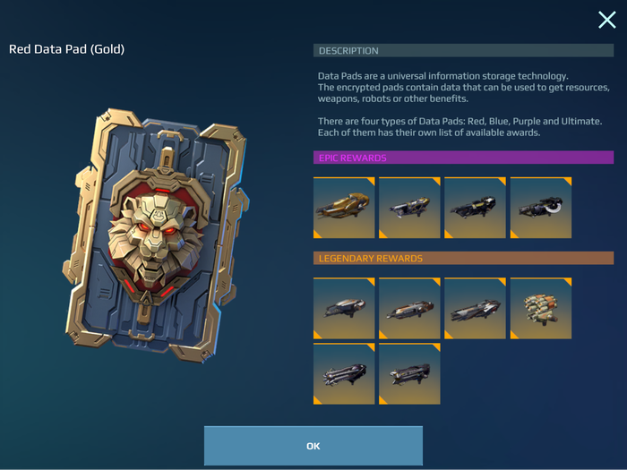
We've also thoroughly overhauled the mechanics of the system. The old system consisted of a static screen featuring a selection of chests, which players could open by spending a set number of event coins, and they had the option to open either one or ten chests at once with a simple tap.
Through experimentation, we settled on a 3-chest, 3-currency system. Each chest and currency feature distinct visuals, creating a sense of progression, and contain different rewards to reinforce this. The coins used to open chests were also utilized in various monetization features, such as in-game quests, offers, and more.
Additionally, the original interface fell short in one crucial aspect: it didn't provide players with any information about the potential rewards they could earn with their coins. To get that info, players had to waste time navigating to a separate screen, searching for the chest that corresponded to their coins.
The old system was plagued by issues that made it difficult for players to understand what was going on: coins and chests were often confusingly similar or vastly different, leading to player frustration and confusion.
Our rework addressed these problems head-on. First of all, we now offer Data Pads directly, rather than the keys to unlock them. This eliminates the need for players to keep track of unnecessary information and clears up confusion about which coin corresponds to which chest. This change also optimized our production pipelines, allowing our art team to focus on a single entity without having to create intermediate links in the form of event currencies.
Second, each Data Pad now features a button that opens an information window, displaying the potential prizes within. This simplifies the purchasing process because players can now easily find out which Data Pad contains a more desirable reward. This button is conveniently available at all points where Data Pads can be obtained, including battle passes, leaderboards, and offers.

Third, the event interface has undergone a significant overhaul. It no longer displays Data Pads that are inaccessible to the player. Unlike the static presence of three chests on the screen, Data Pads may be absent, and if a player only has one type of Data Pad, they can only interact with that one.
***
This is far from the end of our journey. With all of our work, we continue to push further, refine our features, and Data Pads are no exception.
Not everything went smoothly, but we've learned from our experiences. As an example of that last point, the idea of connecting screens through pedestals didn't quite work out as planned.
We also needed to improve the readability of the value between the first Data Pads, which was accomplished by the next event. Additionally, we refined the polishing effects, which had a significant impact on players' perceptions of Data Pad rarity.
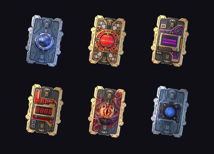
Most importantly, the feature resonated with players and achieved its primary goal of reversing the trend of fading interest in events, creating a truly explosive "wow" effect. The metrics we collected confirmed the importance of offering a wide range of choices in such features. To bring things to a close, I'd like to commend the entire team for their outstanding work with Data Pads!
About the Author(s)
You May Also Like



.jpeg?width=700&auto=webp&quality=80&disable=upscale)


.jpg?width=700&auto=webp&quality=80&disable=upscale)
