Featured Blog | This community-written post highlights the best of what the game industry has to offer. Read more like it on the Game Developer Blogs or learn how to Submit Your Own Blog Post
Leveraging Emotional Design Features to Enhance Character Perception in Pixel Art
This article explores how emotional design features - colours and shapes - influence player perception of pixel art characters. By understanding these design elements, game developers can create characters that elicit specific emotional responses, improving player engagement and retention. The article includes practical tips on applying these findings to character design in pixel art.
June 20, 2024

This article explores how emotional design features - colours and shapes - influence player perception of pixel art characters. By understanding these design elements, game developers can create characters that elicit specific emotional responses, improving player engagement and retention. The article includes practical tips on applying these findings to character design in pixel art.
Introduction
The relationship between character design and player perception is crucial for creating engaging gaming experiences. While previous research has focused on the impact of character appearance on player perceptions, there is limited knowledge about how emotional design features specifically affect pixel art characters. The research described in this article aims to bridge that gap, providing insights that can help developers create emotionally resonant characters using cost-efficient pixel art.
The Value of Emotional Design Features
Character appearance significantly shapes player perceptions and emotional responses. Even the slightest alterations in a character's design can substantially change how players perceive and connect with them. Players often deeply empathise with non-playable characters in narrative-driven games like the Mass Effect series. This connection enhances the gaming experience and encourages player retention.
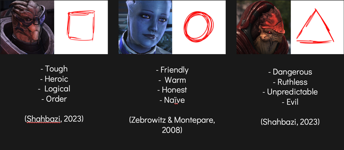
Colour and shape psychology is widely used in narrative-driven games, such as Mass Effect.
Character appearance is formed by design choices, also called emotional design features. Colours and shapes are among the most basic emotional design features and among the few actually used in pixel art. This article aims to describe how and to what extent emotional design features impact character perception in pixel art.
Colour and Shape Psychology
Colour and shape significantly influence players' emotional responses and perceptions in games. Warm colours like red and yellow evoke danger, excitement and energy, while cool colours like blue and green promote trust and calmness. Neutral colours, such as black and white, convey power and purity, respectively. Shapes also play a role: circles and curves are seen as friendly and safe, squares as stable and reliable, and triangles as dynamic and aggressive. Game developers can use these psychological principles to enhance character development and storytelling, creating more engaging and immersive gaming experiences.

For the sake of simplicity, this experiment was limited to 4 colours—3 primary and 1 secondary—and 3 shapes. Each colour and shape has strong associations, common in design psychology research.
The Experiment Design Process
To see if this would apply to pixel art, we conducted an experiment among 48 participants, predominantly male (61%), with a balanced age distribution predominantly under 34 years old.
The participants were split into two groups—8 were observed in a controlled environment, while 60 others completed the experiment from their homes, providing insights into natural settings.
Participants were shown twelve characters individually, one by one, selecting associated traits from a predefined list. This was facilitated through a digital questionnaire available at https://mgtexp.com. A detailed experiment description is provided below to help understand its design and execution:
Character creation. Twelve pixel art characters were created using combinations of four colours (red, green, blue, purple) and shapes (circle, square, triangle). Each character featured a unique combination of colour and shape, such as red triangles, blue circles, green squares, etc.

Hypotheses. A hypothesis was created for every character based on previous research – for example, the red triangular character would be perceived as “dangerous”, and the green round-shaped one as “friendly”.
Data collection. Participants were shown the characters individually. For each character, they selected associated traits from a predefined list, choosing 48 traits in total – 3 for every character. Moreover, participants responded to personal questions about age group, gender, and gaming experience.
Analysis. All responses were collected and subjected to statistical analyses to determine which colours and shapes were most strongly associated with each trait. The responses' correlation with personal data was also analysed. This analysis helped derive the conclusions discussed below.
Data Insights
Based on the data analysis, four different situations were determined:
19 hypotheses - the original hypothesis was confirmed, and the data was statistically significant at a significance level of 0.05;
6 hypotheses - the original hypothesis was rejected due to the wrong hypothetical value, but the data was still statistically significant at a significance level of 0.05, meaning that there was a correlation between colour and shape and the resulting answers;
6 hypotheses - the original hypothesis was rejected due to the statistical insignificance of the data at a significance level of 0.05, but the hypothetical value was still the most common answer;
5 hypotheses - the original hypothesis was rejected due to the inconsistency of the answers, and the data was statistically insignificant at a significance level of 0.05.
According to the analysis, the participants' responses could be predicted at least for 25 characters out of 36. Some of the analyses have shown inconsistent results, suggesting that colours have a stronger impact on character perception than shapes. It was found that colours and shapes influence each other, alternating character perception when working together. Moreover, there seems to be a gender and personal experience bias in character perception for secondary colours.
Key Findings
Primary Colours and Perception: Primary colours strongly influence character perception, consistently evoking specific emotional responses. For example, red signifies danger or excitement, while blue conveys calmness or sadness.
Shapes and Their Interplay with Colours: Shapes impact character perception to a lesser extent than colours. However, the combination of colours and shapes can enhance or mitigate their individual effects. For example, a red triangle might be perceived as more aggressive than a red circle.
Ambiguity of Secondary Colours: Secondary colours like purple tend to be more ambiguous and subject to personal interpretation, leading to less consistent emotional responses from players. It was also discovered that there could be a gender difference in how players perceive secondary colours.
Practical Application
To apply these findings, game developers should consider the following:
Controlled Use of Primary Colours: Leveraging primary colours can create characters with predictable emotional impacts. For instance, using red for antagonistic or dangerous characters and blue for trustworthy allies can help establish clear emotional cues.
Combining Colours and Shapes: Thoughtfully combining colours and shapes can enhance character design. For example, a friendly character might be designed using soft, round shapes and green colours. On the other hand, if the goal is to create a controversial character, mixing “positive” colours and “negative” shapes (and vice versa) can be considered.
Avoid Overuse of Secondary Colours: Given their ambiguous nature, secondary colours should be used sparingly and strategically to avoid inconsistent emotional responses. While purple is widely used as a “villain” colour in digital character design, the data suggests that this colour elicits mixed feelings if no other emotional design features specifically portray a character as a villain.
Testing and Feedback: Regularly test character designs with target audiences to gauge their emotional responses and adjust designs accordingly. While the study's initial hypotheses were based on popular colour psychology patterns, only half were confirmed.
Conclusion
While this research confirms that emotional design features significantly impact character perception in pixel art, its findings also suggest that players perceive secondary colours very subjectively. By understanding and applying these insights, game developers can create more engaging and emotionally resonant characters, improving player enjoyment and retention.
About the Author(s)
You May Also Like




.jpeg?width=700&auto=webp&quality=80&disable=upscale)


.jpg?width=700&auto=webp&quality=80&disable=upscale)
